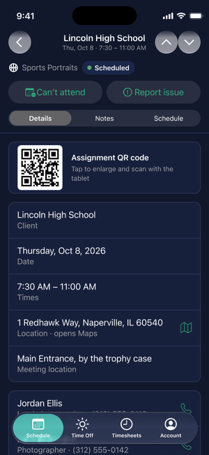
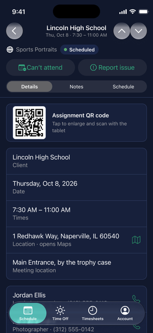
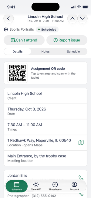
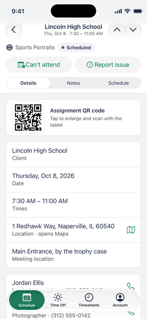
Nine changes made to the Figma screens and the HTML demo, November 5 and 6, 2026. Each page gives the problem, the change, the rationale, the trade-off accepted, and old and new screenshots.
The rationale on each page is what I discussed in the design sessions, and I made the call on each one. Anything that was a judgement, such as breaking consistency, is called out as a trade-off.
Look less like buttons; glyph colour set directly, not by token
Figma, demo
Not yet tested: Dynamic Type at the largest sizes, VoiceOver, and a Figma frame for the assignment-day screen with the menu. Open library changes are in the Library change requests project doc.
1. Secondary actions: a menu behind the primary button, buttons when there is none
Problem
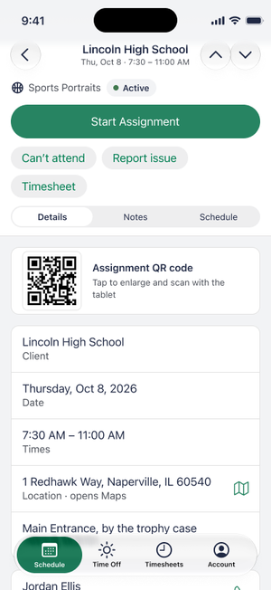
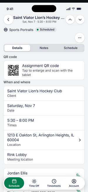
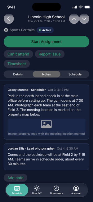
The pinned header was 350 pt tall, 40% of an 874 pt screen: type and status, the primary button, a row of 34 pt secondary buttons that wrapped (Timesheet dropped to a second line), and the tabs. Dynamic Type would make it taller still. On a future-dated assignment there is no primary button, so a menu alone would leave a lone "…" in an empty row.
Change
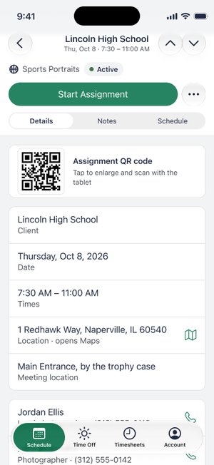
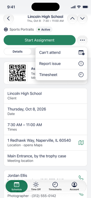
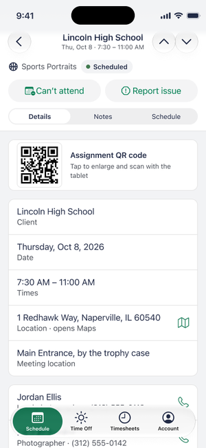
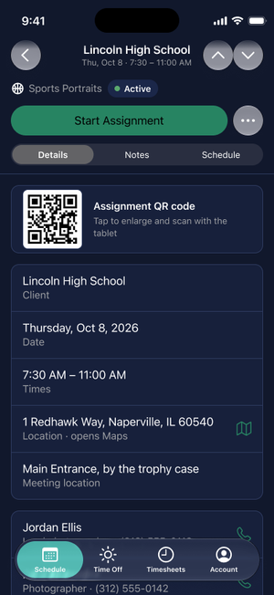
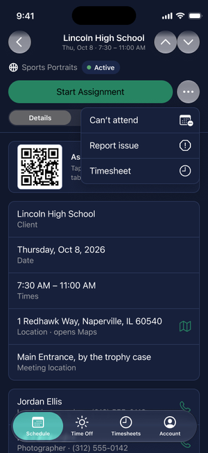
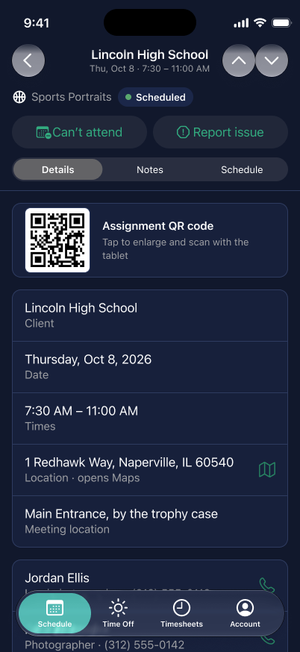
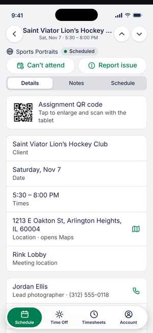
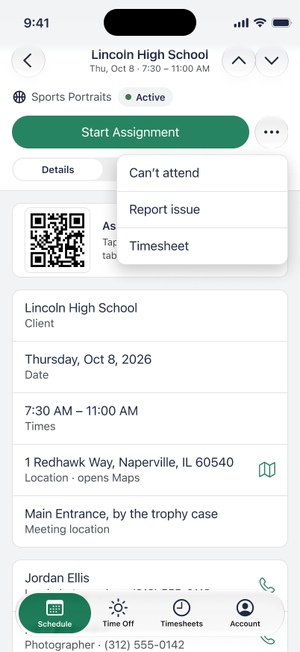
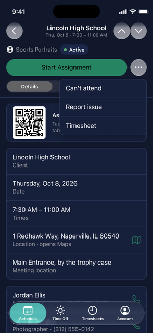
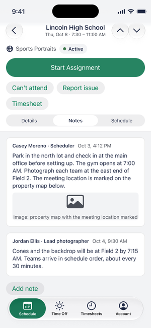
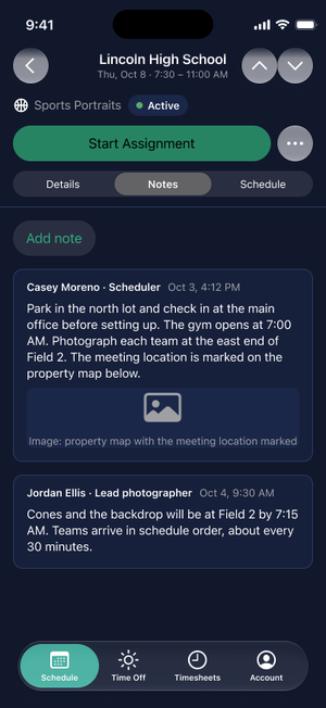
With a primary button, the header holds type and status, then one row with the primary button and a 44 × 44 pt More button, then the tabs. Can't attend, Report issue and Timesheet move into the More menu (48 pt rows), and the Timesheet row card leaves the Details tab. With no primary button, Can't attend and Report issue show as two 44 pt buttons side by side. Once an assignment is fully done, no secondary actions remain, so neither appears.
Options
(a) 44 pt buttons in one row, plus collapse on scroll: 318 pt at rest (36%), 224 pt scrolled (26%), but it grows as labels wrap at larger text sizes. (b) Always a menu: 256 pt (29%), 218 pt scrolled (25%), and the same height at any text size. (c) Visible before Start Assignment and a menu after: a row of Can't attend and Report issue under the primary button, about 308 pt (35%) at rest, scrolling away to a 218 pt pinned header.
Rationale: menu
These actions are rarely used on the day of the assignment, so they should not take permanent space from the one action used every time. This is based on anecdotal feedback from stakeholders.
Rationale: buttons
With no primary button there is nothing for the actions to compete with, and there is room. A future assignment is also when cancelling matters most: a reassignment needs the most lead time.
The principle
Secondary actions never compete with the primary action. With a green primary button they sit behind a menu; without one they are shown. The same actions are in different places on different days, so consistency of location is broken on purpose, in favour of coherence: in every state the screen has one clear thing to do, and the lone "…" button would have hidden the only things left to do. (Wording drafted from the design discussion; to be confirmed.)
Trade-off
Can't attend and Report issue are time-sensitive, and with a primary button they now take two taps and are not labelled on screen. The cost falls on few people. A person may also have to relearn where the actions are when a day changes state. I think urgent actions should be visible before the assignment starts, but in this design they are visible only the day before, when there is no primary button; from the assignment day until Start Assignment they are in the menu. Accepted to keep the header short. Fallback if testing shows they are hard to find: option (c), then (a), kept on the Figma proposal page as "ALT visible row".
Decision
I chose the menu (b), and chose to show the buttons when there is no primary button. When I considered showing the actions on the assignment day too (c), I kept the design as built.
Where
Figma: Proposal – Assignment header, including AFTER (no primary, future assignment). Demo: built. Evaluation: "Proposal: Assignment header".
SwiftUI
Menu with SF Symbol labels behind the primary button; two bordered buttons when there is none. Implementation notes
Before
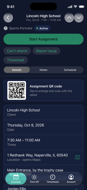
Before: Light, 350 pt, Timesheet wrapsBefore: Dark
After, Light: primary button, menu open, no primary
After: with primary, 256 ptAfter: menu openAfter: no primary, two buttons
After, Dark: the same three states
After: with primaryAfter: menu openAfter: no primary
Demo, no primary
Before: empty row with only MoreAfter: two buttons
Even at 256 pt, the type and status row is not needed once the person has scrolled.
Change
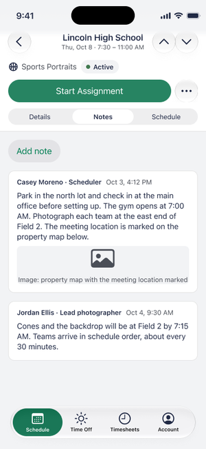
The type and status row scrolls away. The primary row and the Details / Notes / Schedule tabs stay pinned: 218 pt in Figma, 215 px in the demo.
Options
Unpin the tabs: saves about 40 to 50 pt (5%), but switching views would mean scrolling back to the top, and Details is the long tab. Unpin the primary button: the pinned area drops to about 170 pt, but Start Assignment would scroll out of view.
Rationale
The tabs are the cheapest element and the one most likely to hurt if unpinned; the primary action is the one that must stay reachable.
Tradeoff
A pinned area of about a quarter of the screen remains. It collapses as a static state, not an animation.
Decision
I asked for the collapse in the demo after discussing the options.
Where
Figma: scrolled frames. Demo: built.
SwiftUI
A pinned section header in a ScrollView; the collapse is simply the scroll position. Implementation notes
Light and Dark
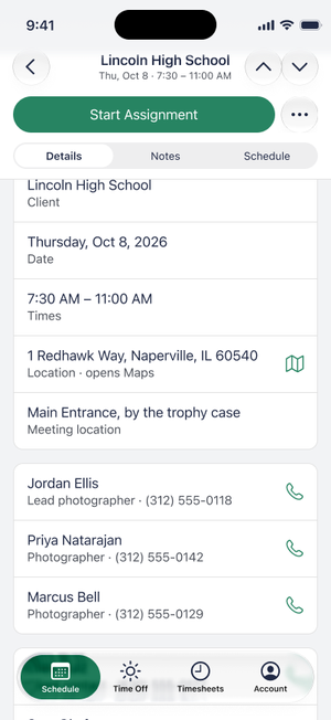
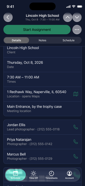
Before: pinned at 350 ptAfter, scrolled (Light)After, scrolled (Dark)
Three plain-text menu rows looked unfinished next to a system menu, and the same action would look different in the menu and on the buttons.
Change
Can't attend gets calendar.badge.minus, Report issue gets exclamationmark.octagon (an exclamation in a stop sign), Timesheet gets clock, matching the Timesheets tab. Trailing in the menu, leading on the buttons, the same symbol in both places.
Rationale
Icons help scanning in iOS menus. The warning triangle was avoided because it reads as an error state.
Tradeoff
Icons are decoration, not the only cue: labels stay and VoiceOver ignores the symbol. The demo draws look-alike SVGs; the native build should use the real SF Symbols.
Decision
I chose the three symbols.
Where
Figma: menu-open and no-primary frames. Demo: built.
SwiftUI
The real SF Symbols through Label; VoiceOver reads the title only. Implementation notes
5. Demo: section headings removed on the Assignment tabs
Problem
The demo showed headings (QR code, When and where, Logged times, Notes, Shoot schedule) between the cards on the Assignment tabs, but not above the contacts. Figma has none.
Change
The headings are removed. Cards are separated by spacing only, as in Figma. The tab control already names the Notes and Schedule views.
Tradeoff
The Logged times card no longer has a label; each row is a self-explanatory title with a time. I have not checked whether Figma shows Logged times at all.
Decision
I noticed the difference; the demo was changed to match Figma.
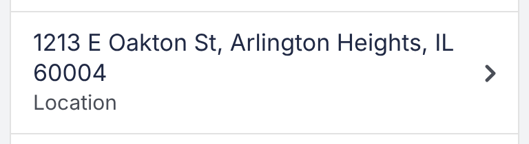
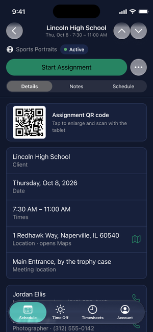
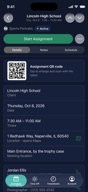
The demo showed a caret on the Location row. The PRD says "Location, with an icon showing it is tappable", and Figma shows a map icon. The caret had been in the demo since its first commit.
Change
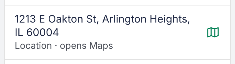
A map icon in the accent color, and the subtitle "Location · opens Maps" as in Figma. Tapping still opens the map picker.
Tradeoff
None found. The icon is a hand-drawn SVG that approximates SF Symbol map.
Decision
I noticed the difference.
Where
Demo only.
SwiftUI
A Label with the map symbol; hand off to Apple Maps (to confirm). Implementation notes
Green label text on the translucent grey bordered button measured 4.2:1 in Dark (on a card) and about 4.4:1 in Light, below the 4.5:1 AA target (findings 6 and 20).
Change
Figma proposal buttons: Dark fill 24% to 16% (label 5.1:1), Light fill 12% to 8% (4.65:1). Demo, Light only: bordered buttons are white with a hairline border (5.11:1), because no grey tint reaches 4.5:1 on the grey page. Demo Dark already passed.
Rationale
Lowering the fill keeps the grey button look and fixes the Dark half of finding 20.
Tradeoff
In Light, a bordered button inside a white card now reads as an outline. The Figma change is an override on the two proposal buttons only, because the Button component is in a library. Plain rows (Take photo, Choose from library) are not fixed by this; they need a lighter accent-text token. See the Library change requests doc.
8. Dark mode: white label on the green primary button
Problem
In Figma Dark the primary button label was black, because the Brand/On Accent token is black in Dark. The demo and Figma Light use white.
Change
The labels on the green fill use the Light value of Brand/On Accent, so they are white. 68 labels changed (Dark prototype page 42, Assignment Details 16, proposal page 10). The token binding is kept.
Rationale
White gives 4.60:1 on #278462; black gives about 4.5:1. Both pass; white matches the demo and my preference.
Tradeoff
A narrow pass. About 60 other labels on the lighter selected-tab fill stay black because white there is unmeasured. The clean fix is white in the library token; see the Library change requests doc.
Decision
I preferred white.
Where
Figma: Dark screens.
SwiftUI
Prominent style with Brand.onAccent. Dark with Increase Contrast fails (white on #6EC6A0 is 2.05:1); a token fix is needed. Implementation notes
Figma, Dark: Start Assignment
Before: black labelAfter: white label (4.60:1)
Zoomed on the button
Before: black on #278462 (about 4.5:1)After: white on #278462 (4.60:1)
9. Back, previous and next: no fill, accent glyphs
Problem
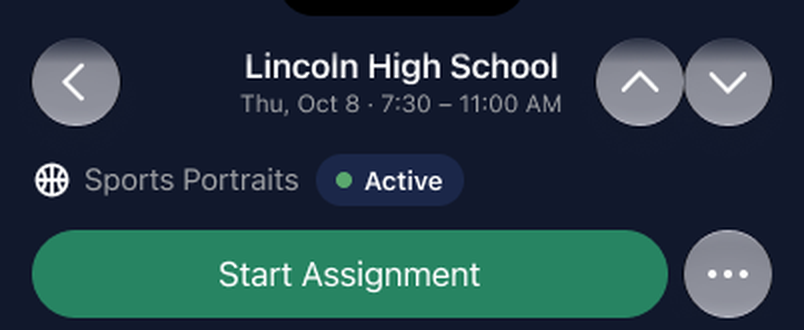
The back, previous, next and More buttons used a translucent glass fill. In Dark the More glyph measured 3.57:1 and the other three had a fill only 3.2–3.5:1 against the page. Darkening the fill fixed contrast but needed a Figma-only override that SwiftUI would not reproduce. Once the glass is removed, the up and down arrows could also read as decoration.
Change
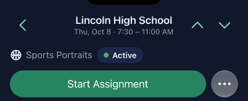
Back, previous and next have no background. Their glyphs use the accent colour, the same as the map and phone icons, so they read as tappable. They keep their 44 pt hit areas and dim when disabled (first or last assignment). More keeps its circle, with a solid #656875 fill in Dark (white glyph 5.97:1), because it sits beside the large green button and would otherwise look like stray dots.
Rationale
On a solid pinned header the glass adds no legibility, so a fill is not needed. The accent colour is the app's one signal for "tappable" on plain rows. Glyph contrast against the page: Dark #80CCB1 9.4:1, Light #007E52 5.11:1, the same colours as the demo.
Tradeoff
Plain glyphs look less like buttons than circles. The glyph colours are set directly on these buttons (no token binding) because the file has no local variable for them; the library accent (#278462) is dimmer in Dark. The Figma changes are overrides on the proposal frames only. The demo applies the plain style to every toolbar back button; other Figma screens still show the glass back button.
Decision
I agreed with removing the fill and asked how to keep the arrows from looking like decoration.
Where
Figma: proposal frames, Light and Dark. Demo: toolbar buttons.
SwiftUI
Plain toolbar buttons with accent glyphs; keep the system back button first (to test). Implementation notes
Figma, Dark: header buttons
Before: glass fill (More glyph 3.57:1)After: plain accent glyphs; More solid #656875