VIP Photographer App: Demo Heuristic Evaluation
Nov 5, 2026 · Alan Porterfield
The demo is structurally sound and close to the HIG, but 21 problems need fixing before user testing: 4 major (unlabeled switches, no password recovery, silent loss of typed text, no Dynamic Type), 13 minor and 4 cosmetic. Checks covered 35 demo screen states and about 130 Figma frames in each of Light and Dark; section "Figma and demo compared" says which problems are in the design and which only in the demo.
Fix first
- Name every switch (#1). Seven switches (six on Notifications, one on Account) read as just "switch" to VoiceOver. Tie each to its row label.
- Add password recovery (#2). Sign in has no "Forgot password?" and the verification step has no alternate route. A photographer locked out on assignment day has no way back in.
- Stop silent loss of typed text (#3). Tapping outside any sheet closes it and discards what was typed. Confirm before discarding.
- Grow touch targets to 44 × 44 pt (#5). Chips are 36 pt, segmented controls 28 pt, and several buttons 34–43 pt. Extend hit areas without changing how they look.
- Fix contrast in the Figma tokens (#6, #19–21). Accent text on tinted buttons, destructive red in Figma, Dark-mode green text and one black placeholder fall below AA. Fixing the variables fixes the build too.
Findings
Severity follows Nielsen's 0–4 scale: 3 = major (fix before release), 2 = minor, 1 = cosmetic. "Measured" means read from the running demo; "from code" means read from the source and not exercised.
| # | Sev | Where | Finding | Heuristic / HIG | Fix | Found in | Screenshot |
|---|---|---|---|---|---|---|---|
| 1 | 3 | Notifications, Account | Seven switches have no accessible name (measured). VoiceOver says "switch" with no label. | HIG Accessibility | Link each switch to its row title. | Demo (Figma: label not specified) | 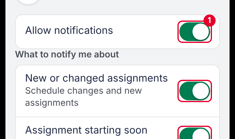 |
| 2 | 3 | Sign in, Verify it’s you | No "Forgot password?", and no alternate method if the text message doesn’t arrive (the code screen has Resend). Failed and expired codes are undesigned. | N3 control, N9 recovery | Add a reset flow and a "Try another way" route that reaches the scheduler. | Both (Figma has no Sign in screen) | — |
| 3 | 3 | All sheets with fields | Tapping the dimmed area closes the sheet and discards typed text, with no warning (from code). Affects Equipment issue, Add note, Edit timesheet, Request Time Off. | N5 error prevention; HIG Sheets | Ask "Discard changes?" when any field has text, or disable outside-tap dismissal on forms. | Demo (read from code) | — |
| 4 | 3 | Whole demo | Type is fixed in px (48 declarations, 3 in rem), so Dynamic Type can’t be tested. Nothing shows how the pinned Assignment header or sheets behave at larger sizes. | HIG Typography | Build with text styles and test at the largest accessibility size before handoff. | Demo (Figma not checked) | — |
| 5 | 2 | Assignment, sheets, lists | Targets under 44 pt (measured): chips 36, segmented controls 28, previous/next 40 × 40, Edit 43 × 40, Cancel 63 × 40, Done 50 × 40, Resend code, Update photo, Pay rates and Add 34, switches 50 × 31, Back and show-password 43 × 43. Figma has the same problem: its secondary buttons are 34 pt high (Can’t attend, Report issue, Timesheet, Add note, Edit, Cancel, Done, Update photo, Pay rates). | HIG Layout (44 × 44 pt) | Extend hit areas with padding; visual size can stay. | Both | 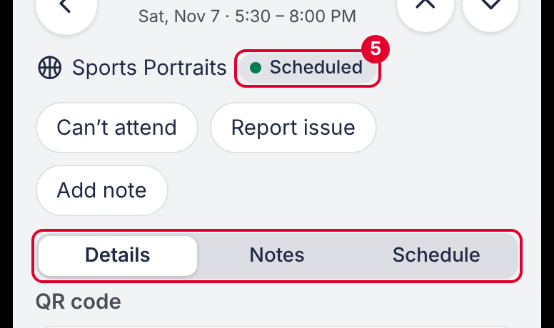 |
| 6 | 2 | Timesheets, Account | Light mode: accent text on the tinted bordered button measures 3.99:1 ("Pay rates") and 4.41:1 ("Update photo"). AA needs 4.5:1. Figma measures the same (4.43:1 on the button fill, 4.02:1 on "Pay rates"), so this is a token problem, not a demo one. | HIG Color and contrast; WCAG 1.4.3 | Darken the accent-text token or drop the tint. Tried: in the demo, Light bordered buttons are now white with a hairline (5.11:1 for Pay rates and Update photo; no tint reaches 4.5:1 on the grey page); in the Figma proposal frames the Light fill is 8% (4.65:1). The Figma and repo Light accent also still differ. | Both | 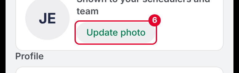 |
| 7 | 2 | Timesheets list | The Open entry row shows a pen, but tapping opens a read-only entry with an Edit button. The pen promises edit-in-place. | N4 consistency | Replace the pen with a chevron. | Both | 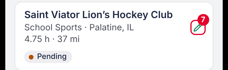 |
| 8 | 2 | Schedule, Details, Timesheets | One job type has several names: "Sports Portraits" on Schedule and Details, "School Sports" on Timesheets, "School Pictures" in the demo, "School portraits" in the docs. | N2 real-world match | Agree one set of type names and use it everywhere. | Both | — |
| 9 | 2 | Forms, banners | Inline errors and banners ("Arrived at…", "Changes saved") aren’t announced: only three live-region or alert roles in the source. | HIG Accessibility; N1 status | Mark errors and banners as alerts or status messages. | Demo (read from code) | — |
| 10 | 2 | Schedule tab control | The red dot on "Past 5 days" is color-only, with no text alternative. | HIG Color; WCAG 1.4.1 | Add a hidden label ("needs attention") or a count. | Both | 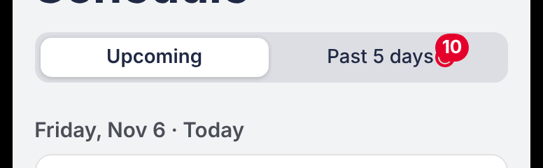 |
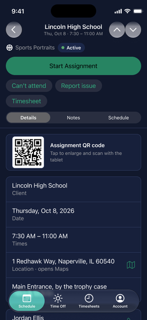
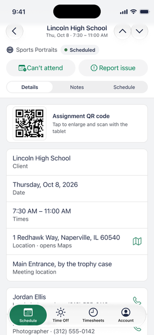
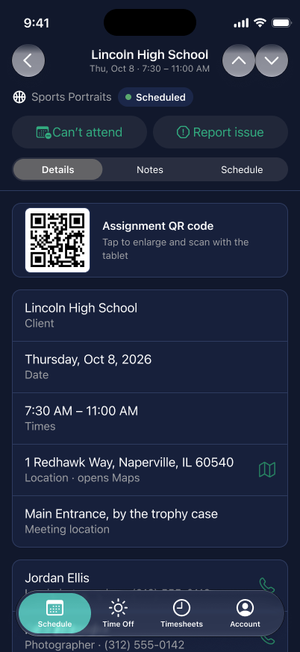
| 11 | 2 | Assignment Details | The pinned header (type, status, primary button, chips, segmented control) takes about 33% of the screen height in the demo and 35–40% in Figma (308–350 of 874 pt); with the tab bar, a little over half the screen is left for content. | N8 minimalist | Move the rarely used secondary actions into one More menu and collapse the header on scroll (see proposal). | Both | 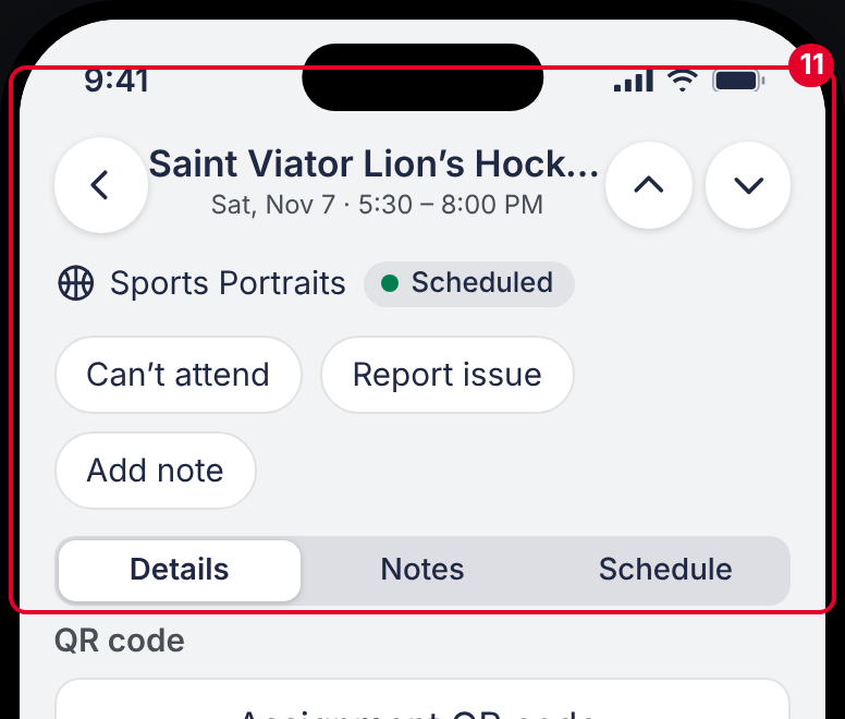 |
| 12 | 2 | Equipment issue, Add note, Edit entry | Multi-line fields use the browser default (monospace, resize grip, 36 pt high) and look unlike every other field. | N4 consistency | Style them as text fields; start at 3 lines. | Demo | 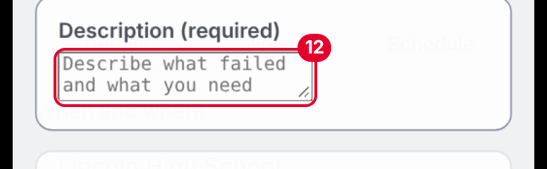 |
| 13 | 2 | Timesheet sheet, Travel log | In the demo, the read-only Timesheet sheet and Travel log have no Cancel or Close; the only exits are the primary button and tapping outside. Figma already has Cancel on S7b and Done on S3c. | N3 control; HIG Sheets | Match Figma: add Cancel or Done to the demo sheets. | Demo only (Figma has Cancel and Done) | 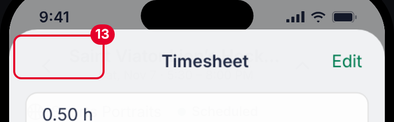 |
| 14 | 2 | Create account | Email isn’t checked; any text enables Continue. | N5 error prevention | Validate format and show the live hint pattern from decision 101. | Demo (Figma shows no validation) | 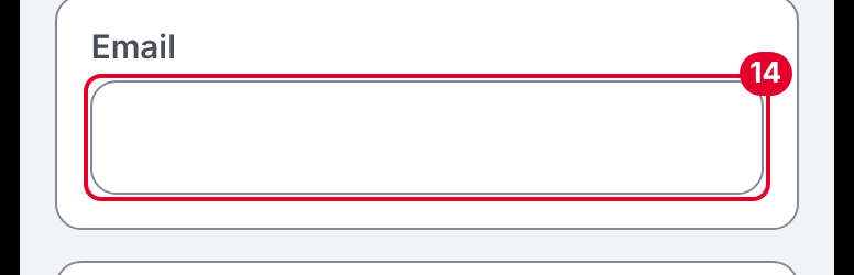 |
| 15 | 1 | Request Time Off, Date range | Dates use the browser’s mm/dd/yyyy input; the native build needs the iOS date picker, with the same limits. | HIG Pickers | Prototype artifact; replace in the native build. | Demo | — |
| 16 | 1 | Timesheet sheet | "Add toll or receipt" offers only an amount, with no receipt capture. | N2 match | Rename "Add toll" or add receipt capture. | Both | 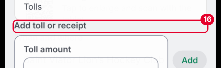 |
| 17 | 1 | Account, Timesheets | Edit appears as a pen per row on Account and as a text "Edit" button on timesheets and the travel log. There’s a reason (one value vs. a form) but nothing signals it. | N4 consistency | Keep, and document the rule. | Both | — |
| 18 | 1 | Equipment issue | "Camera" is preselected, so a report can be sent without choosing an equipment type. | N5 error prevention | Start with none selected and require a choice. | Demo (Figma not checked) | 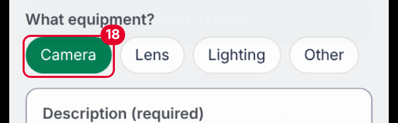 |
| 19 | 2 | Figma: Time Off detail and action sheets | Destructive red text ("Cancel Time Off", "Withdraw request") measures 2.81:1 in Light (#FF383C on the grey button) and 3.9:1 in Dark (#FF4245 on #292F40). The demo’s red passes (5.1:1 and 5.57:1). | HIG Color and contrast; WCAG 1.4.3 | Use the darker red from the demo in the Figma variables. | Figma only | 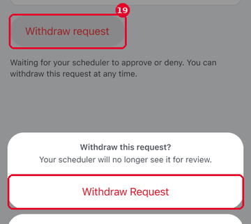 Figma: Time Off – Withdraw request – action sheet – Light (node 309:22049) |
| 20 | 2 | Figma Dark: photo menu, Timesheets | Green text on the dark navy surface is too dim: "Take photo" and "Choose from library" are 3.49:1 (#278462 on #17203B) and "Pay rates" is 4.22:1 (#32AB7F on #2E354C). Dark mode uses two different greens for the same role. | HIG Color and contrast; N4 consistency | One lighter accent-text token for Dark, checked at 4.5:1 on every surface it sits on. The grey half is fixable by lowering the bordered-button fill in Dark from 24% to 16% (Pay rates then measures about 4.7:1; tried on the proposal buttons only, since the Button component is a library component). "Take photo" and "Choose from library" sit on plain rows with no grey, so only the lighter green fixes them. | Figma only | 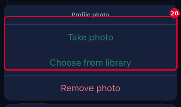 Figma: A9 Update photo sheet – Dark (node 696:40664) |
| 21 | 2 | Figma Dark: S6f Edit travel log | The placeholder "Describe what happened" is black on the dark field (1.43:1) and almost invisible; confirmed in a screenshot. Only this one layer was flagged. | HIG Color and contrast; N6 recognition | Bind the placeholder to the Dark placeholder token. | Figma only | 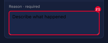 Figma: S6f Edit travel log – Dark (node 467:37609) |
Proposal: Assignment header, before and after
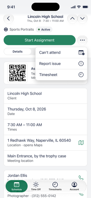
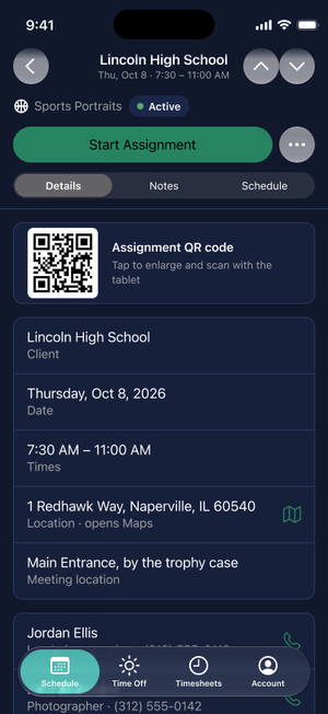
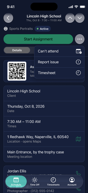
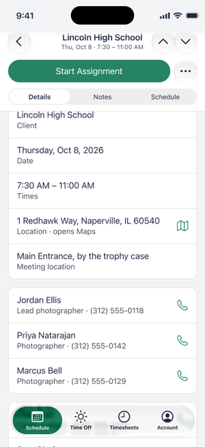
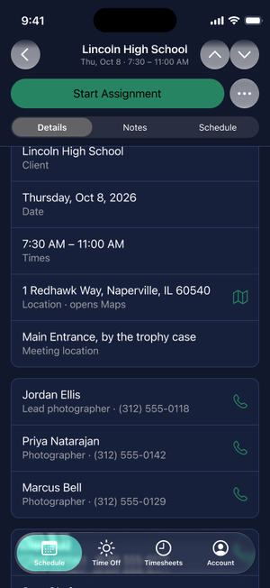
Built as a separate page in the Figma file, "Proposal – Assignment header". The originals are untouched. The proposal puts the three secondary actions, Can't attend, Report issue and Timesheet, under one More menu. These actions are rarely used on the day of the assignment, so they should not take permanent space from the one action used every time, the primary button. This is based on anecdotal feedback from stakeholders; usage has not been measured.
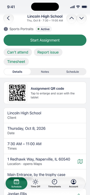
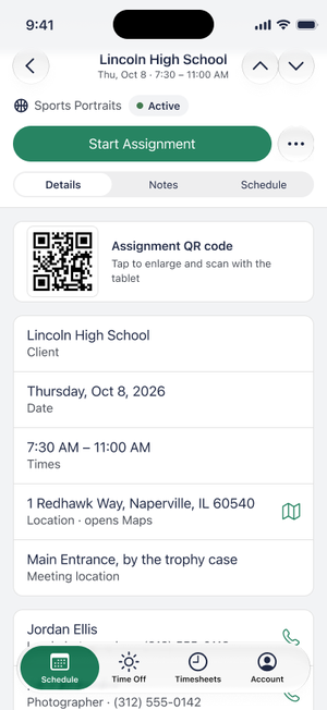
What changes: (1) the header holds the type, status, then one row with the primary button and a 44 × 44 pt More button (accessible name "More actions"); (2) the More menu lists Can't attend, Report issue and Timesheet as 48 pt rows; (3) the Timesheet row card leaves the Details tab; (4) when the content scrolls, the header collapses to the primary row and the Details / Notes / Schedule control; (5) on the Notes tab, Add note (lead only) sits above the first note, where it can't fall below the fold.
Pinned header height on the S4 Details frame (874 pt screen, 95 pt tab bar), measured in Figma: before 350 pt (40%); with the menu 256 pt (29%); collapsed on scroll 218 pt (25%). Space left for content above the tab bar: 429 pt before, 523 pt with the menu, 561 pt scrolled. The menu keeps the header the same height at any Dynamic Type size, because the row holds only the primary button and a fixed icon button; the earlier visible-row version (318 pt, 224 pt scrolled) would grow as the secondary buttons wrapped.
Trade-offs: Can't attend and Report issue are time-sensitive, and they now take two taps and are not labelled on screen. Because they are rarely used on the day, that cost should fall on few people. If testing shows people can't find them, the fallback is the visible-row version, kept on the same Figma page as "ALT visible row". The first-time cost is discoverability: confirm in user testing that photographers find Can't attend in the menu.
Icons on the secondary actions
Each action carries the same SF Symbol in the menu and on the buttons, so it looks the same in both states: Can't attend is calendar.badge.minus, Report issue is exclamationmark.octagon (an exclamation inside a stop sign), and Timesheet is clock, matching the Timesheets tab. In the menu the symbol sits at the trailing edge, as in iOS menus, in the text color; on the buttons it leads the label, in the label color. The labels stay, so the symbols are decoration for VoiceOver (hidden), not the only cue. The demo draws look-alike SVGs; the native build should use the real symbols.
No primary button: show the actions
On a future-dated assignment there is no primary button, because Start Travel only appears on the day. The row would hold only the More button, so the two remaining actions, Can't attend and Report issue, show as two 44 pt buttons instead. There is no primary button for them to compete with, and a future assignment is when cancelling matters most. The cost is that the actions change from menu to visible between states. Once an assignment is fully done, with photos and timesheet submitted, no secondary actions remain and neither the menu nor the buttons appear.
Notes tab: Add note above the notes
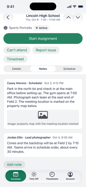
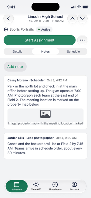
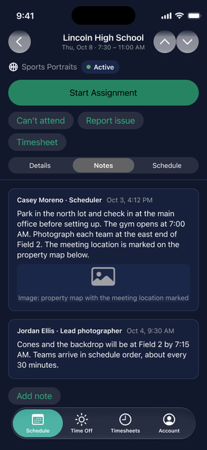
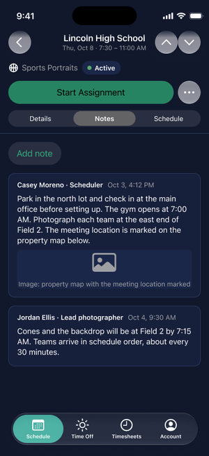
The no-primary frames are on the same Figma page ("AFTER (no primary, future assignment)"). Not done: S2 (assignment day) has no menu frame yet, and no Dynamic Type frame at the largest size was built. The demo now shows the two buttons when there is no primary button, and has the More menu (primary button plus a 44 pt More button, menu rows 48 pt, Escape or any outside tap closes it) and Add note first on the Notes tab. The demo header also collapses on scroll: the type and status row scrolls away and the primary row and tabs stay pinned (measured in the demo: 249 px at rest, 215 px scrolled, on an 874 px screen). The collapse is live there, not an animation. The collapse is shown as a static scrolled frame, not an animation.
Figma and demo compared
The demo is not the only place these problems show up. Where Figma and the demo agree, the problem is in the design; where they differ, the fix is only in the demo or only in Figma.
| Check | Demo | Figma | Verdict |
|---|---|---|---|
| Secondary buttons and chips (5) | 36 pt high | 34 pt high | Design problem. Figma is slightly worse. |
| Segmented control (5) | 28 pt | 32 pt, the iOS standard | Demo only. |
| Previous/next arrows (5) | 40 × 40 | 44 × 44 | Demo only. |
| Switches (1, 5) | 50 × 31, unnamed | 64 × 28, layers named by row | Needs a spec: the accessible label and a 44 pt hit area. |
| Accent text on tinted buttons, Light (6) | 3.99–4.41:1 | 4.02–4.43:1 | Design problem (the accent token). |
| Destructive red (19) | 5.1:1 Light, 5.57:1 Dark | 2.81:1 Light, 3.9:1 Dark | Figma only. The demo’s red is better. |
| Green text in Dark (20) | Passes | 3.49:1 and 4.22:1 | Figma only. |
| Placeholder text in Dark (21) | Passes | Black on navy, 1.43:1 | Figma only. |
| Pinned Assignment header (11) | 33% of screen | 35–40% of screen | Design problem. |
| Symbols and carets | Matches Figma on schedule, Time Off and timesheet rows (chevron), Account (pencil, chevron), Appearance (check), contacts (phone), Location (map, fixed). Differs on the Add toll or receipt and equipment Add photos rows, which show text where Figma shows a plus. | Plus on Add toll or receipt and Add photos; month chevrons on the Time Off and Paid date sheets; warning triangle, camera and up-down chevrons on the QR-unavailable and manual team-log screens; SD card, folder and category screens. | Demo only for the plus rows. The calendar sheets, QR-unavailable help and SD card upload steps are in Figma and not built in the demo. |
What the check excluded: the prototype aids (screen counters, navigation arrows), disabled buttons, the selected tab icon, the Lock screen frames and the dimmed dates on the calendar sheets (1.98:1; exempt only if they are unavailable dates, which I assumed and have not confirmed). Figma contrast compares each text layer with the nearest solid fill behind it; every flagged value was reviewed, but only the black placeholder was checked on a rendered frame.
Nielsen's 10 heuristics
None fails outright. Two are strong (6, 7) and the rest are partial because of the findings listed.
| Heuristic | Rating | Why | Findings |
|---|---|---|---|
| 1. Visibility of system status | Partial | Status chips, the upload bar, Logged times and banners keep people oriented. Banners and the Past 5 days dot aren’t available to VoiceOver. | 9, 10 |
| 2. Match with the real world | Partial | Plain language throughout, but job types have three names, and "receipt" is promised but not offered. | 8, 16 |
| 3. User control and freedom | Partial | Cancel on forms, Withdraw and Cancel Time Off with confirmation, "Not yet" on the early-start alert. Gaps: no password recovery, and the demo’s read-only Timesheet and Travel log sheets have no Close (Figma has one). | 2, 13 |
| 4. Consistency and standards | Partial | Strong shared patterns: pushed Account screens, the disabled-vs-error button rule, one alert style. Gaps in edit affordances and multi-line fields. | 7, 12, 17 |
| 5. Error prevention | Partial | Disabled buttons with hints, numeric-only fields and the early-start confirm work well. Typed text is lost on outside-tap, email isn’t checked. | 3, 14, 18 |
| 6. Recognition rather than recall | Meets | Fields keep visible labels, contacts show role and number, and the Assignment screen shows what has been logged. | none |
| 7. Flexibility and efficiency | Meets for v1 | Previous/next arrows move between assignments, phone rows call in one tap, and Start Assignment is one tap after arrival. No search or filters on lists, which is fine at this size. | none |
| 8. Aesthetic and minimalist design | Partial | Clean cards and one green primary per screen. The pinned Assignment header uses a third of the screen. | 11 |
| 9. Recognize, diagnose and recover from errors | Partial | Inline messages are specific ("Enter a number, 0 or more."). Failed and expired verification codes, a number already in use and offline states are not designed. | 2, 9 |
| 10. Help and documentation | Partial | Calls to the scheduler and account coordinator sit behind Can’t attend and Report issue. There is no general help entry. | 2 |
HIG conformance by area
Structure and patterns follow the HIG; sizing and accessibility details do not yet.
| Area | Status | Evidence |
|---|---|---|
| Navigation and tab bar | Meets | Four tabs, label-free back button, bar-only titles on Account subpages, large titles on the four tab roots. |
| Sheets and alerts | Partial | Cancel at top left, native-style action sheets and a two-button alert with a red destructive action. Gaps: no discard warning, two demo sheets without Close, which Figma already has (3, 13). |
| Touch targets (44 × 44 pt) | Does not meet | More than ten control types measure under 44 pt (5). |
| Typography and Dynamic Type | Not testable | Fixed px sizes; the Figma frames use SF Pro styles (4). |
| Color and contrast | Partial | Demo Dark: no enabled text under 4.5:1. Demo and Figma Light: accent text on tinted buttons under 4.5:1 (6). Figma only: destructive red and some Dark-mode text under AA (19–21). Disabled buttons are exempt. |
| Dark mode | Meets | All 35 states render in Dark with no enabled text under 4.5:1; checked by measurement, not by eye. |
| Accessibility labels | Partial | Every button and link has a name; seven switches don’t (1). The QR code has a label. Errors and banners aren’t announced (9). |
| Forms and data entry | Meets | Labeled fields, number-only amount fields, and the rule that short forms disable the button with a hint while long forms keep it enabled with inline errors. |
| Motion | Not evaluated | One reduced-motion rule exists in the CSS; transitions weren’t exercised. |
| Icons | Partial | Figma uses SF Symbols; the demo draws close approximations, so glyph weight and size differ slightly. |
What works well
- One rule for buttons. Short forms disable the primary until valid and explain why; long forms keep it enabled and show errors on tap (decision 101). Both behaviors are applied consistently.
- One green action per screen. Secondary actions are chips or text, so the next step is obvious.
- Safe destructive actions. Withdraw, Cancel Time Off and Sign out ask first, in red, with a clear Cancel.
- Early arrival handled calmly. Arrival shows a banner, a reminder comes at start time, and only an early Start Assignment asks for confirmation.
- Contacts are one tap. Each person shows name, role and number, and the whole row calls.
- Every flow has a back step. Pushed Account screens and the timesheet edit form use the standard back button, and every form sheet has Cancel.
Coverage and limits
- Evaluated: the demo built from the
mainbranch, run locally in a desktop browser at phone size: 9 sign-in screens, Schedule (both tabs), Assignment Details (Details, Notes, Schedule), 10 sheets and action sheets, Time Off, Timesheets (list, entry, edit), Account, Appearance, Phone number, Change password, Notifications and the Sign out alert (35 states in all). Each state was captured in Light and Dark. - Method: scripted checks for touch-target size, text contrast, accessible names and font size in every state, then a look at the Light screenshots against Nielsen's 10 heuristics and the HIG. I did not look at the Dark demo screenshots; Dark was checked by measurement only. Figma was measured the same way (132 Light and 128 Dark phone-size frames): touch-target size by layer, contrast by fill values. I did not review the Figma screens for usability beyond that.
- Not evaluated: VoiceOver on a device, Dynamic Type, real iOS controls (pickers, keyboard, haptics, swipe-down to dismiss), landscape and iPad, Android, slow or offline use, upload failure and notification-permission states and the live Vercel deployment.
- Weight: one evaluator and no users. A heuristic evaluation usually uses three to five evaluators and finds roughly what an expert sees, not what a photographer in a gym at 7 a.m. struggles with.
- Next step: fix the five items above, then test the Start Travel → Arrived → Start Assignment → Timesheet journey with five photographers, once on a real phone with the largest text size.